Choosing New Covers
I asked the original publisher of the Dead Detective Mysteries to give me back the rights to the books. They were very nice about it, and I began the process of re-publishing them. Since audiences are often interested in how book covers come about, I thought I'd share my experiences with this series.
When publishers accept a manuscript, they often ask the writer for her ideas on what the cover should look like. There is NO guarantee they'll listen, and other writers I've spoken with had covers they hated or felt didn't represent their books at all, but they were stuck with them.
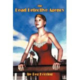
 When asked about a cover for Book #1, I said I pictured a girl on a ship with a mysterious man in the background. My publisher's cover artist chose this as the cover for The Dead Detective Agency. Some people liked it; some didn't. A couple said the girl looked like my daughter; others said she looked like a robot. My first reaction was disappointment, but I recognize that I am NO judge of art, so I left it to them to say what would sell.
This time around, it's up to me what the cover will look like, although I worked with a cover artist because, as I said, art isn't my forte. I still liked the ship/mysterious man combination, so this is what the artist came up with.
The second book had a great cover when it came from the publisher, with the Mackinac Bridge as the background, but I can't use someone else's art when I re-release the book. I asked the new cover artist to do much the same thing but with a little less of a dark feeling, since the books are rather light-hearted in their look at the Afterlife. They definitely aren't scary, spooky, or gory. Here's what we had and what I chose for the new version:
Book Three is my choice of cover, since the old publisher never got around to releasing it. The artist found a detective to represent Seamus and we have several poses, so it will be the same guy in Books 2, 3, and 4. Three looks like this:
I like that there's a theme connecting the books now: similar lettering, the same Seamus, and the character(s) in front of the most important setting, the ship for #1, the Mighty Mac for #2, and Toronto for #3. Note of interest: Title fonts have gotten bigger in the last few years because so many people buy their books online. It's a huge no-no to have the title too small or fussy to read when it's reduced to a tiny little rectangle online (as the original for Book #1 is).
Four isn't coming until next year, but it will feature another pose of the same Seamus with an "old Chicago" cover, since he's going back to solve his own murder. Shout out to Phillips Covers for the new art, and for taking the burden off me. Once again, NOT a cover expert!
When publishers accept a manuscript, they often ask the writer for her ideas on what the cover should look like. There is NO guarantee they'll listen, and other writers I've spoken with had covers they hated or felt didn't represent their books at all, but they were stuck with them.
 When asked about a cover for Book #1, I said I pictured a girl on a ship with a mysterious man in the background. My publisher's cover artist chose this as the cover for The Dead Detective Agency. Some people liked it; some didn't. A couple said the girl looked like my daughter; others said she looked like a robot. My first reaction was disappointment, but I recognize that I am NO judge of art, so I left it to them to say what would sell.
This time around, it's up to me what the cover will look like, although I worked with a cover artist because, as I said, art isn't my forte. I still liked the ship/mysterious man combination, so this is what the artist came up with.
The second book had a great cover when it came from the publisher, with the Mackinac Bridge as the background, but I can't use someone else's art when I re-release the book. I asked the new cover artist to do much the same thing but with a little less of a dark feeling, since the books are rather light-hearted in their look at the Afterlife. They definitely aren't scary, spooky, or gory. Here's what we had and what I chose for the new version:
Book Three is my choice of cover, since the old publisher never got around to releasing it. The artist found a detective to represent Seamus and we have several poses, so it will be the same guy in Books 2, 3, and 4. Three looks like this:
I like that there's a theme connecting the books now: similar lettering, the same Seamus, and the character(s) in front of the most important setting, the ship for #1, the Mighty Mac for #2, and Toronto for #3. Note of interest: Title fonts have gotten bigger in the last few years because so many people buy their books online. It's a huge no-no to have the title too small or fussy to read when it's reduced to a tiny little rectangle online (as the original for Book #1 is).
Four isn't coming until next year, but it will feature another pose of the same Seamus with an "old Chicago" cover, since he's going back to solve his own murder. Shout out to Phillips Covers for the new art, and for taking the burden off me. Once again, NOT a cover expert!


Comments
Post a Comment